Add Charts and Diagrams to Your WordPress Posts and Pages with Easy Chart Builder
Sometimes, the only way to get a point across is to use a diagram, chart, or graph. WordPress doesn’t come with this functionality natively. I don’t know about you, but there are few tasks more difficult than trying to show someone an example or comparison without the use of a good image to back up what you’re trying to prove.
Easy Chart Builder has come to the rescue. This plugin is both easy to use yet complex, and provides you with all of your charting or graphing needs in WordPress.

Join me on a tour of this plugin from start to finish. By the time we’re done, you won’t just know about Easy Chart Builder, but you’ll know how to use it!
Step One: Load in the Plugin
Easy Chart Builder is available through the WordPress Plugin Tool.
- Click Plugins -> Add New
- Search for Easy Chart Builder for WordPress
- Install the plugin
Step Two: Setup the Plugin
Easy Chart Builder has a lot of settings that you need to be aware of. You’ll want to setup the plugin to match your site.
- Hover Mouse over Settings
- Click Easy Chart Builder
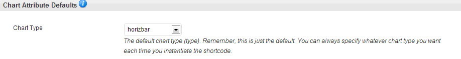
Default Graph/Chart Type
When you setup Easy Chart Builder, you have the option to select the default type of chart. You’ll want to set the chart type each time you use a chart, but it is always a good idea to pick the type of chart you’ll use most frequently.
Here are your choices:
- Horizontal Bar Graph (horizbar)
- Vertical Bar Graph (vertbar)
- Pie Chart (pie)
- Line Graph (line)
- Horizontal Bar – Stack (horizbarstack)
- Vertical Bar – Stack (vertbarstack)
- Horizontal Bar – Overlap (horizbaroverlap)
- Vertical Bar – Overlap (vertbaroverlap)

Chart Height / Width
These fields set the default height / width. These are primarily used for special calculations. Until you’re used to how Easy Chart Builder works, it is safe to leave these set to the defaults.
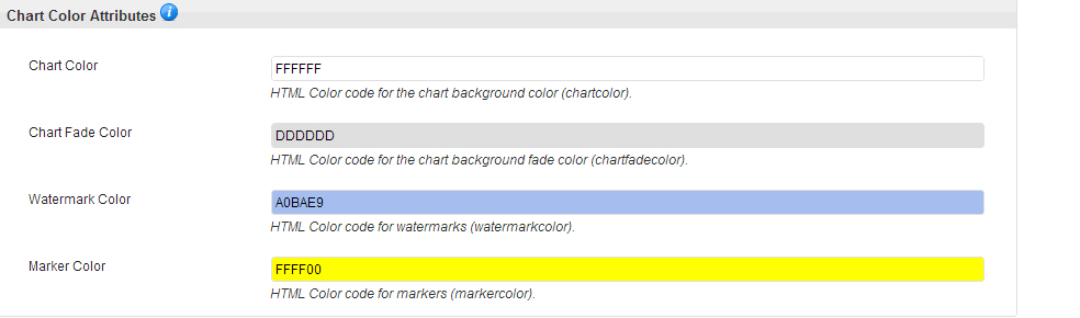
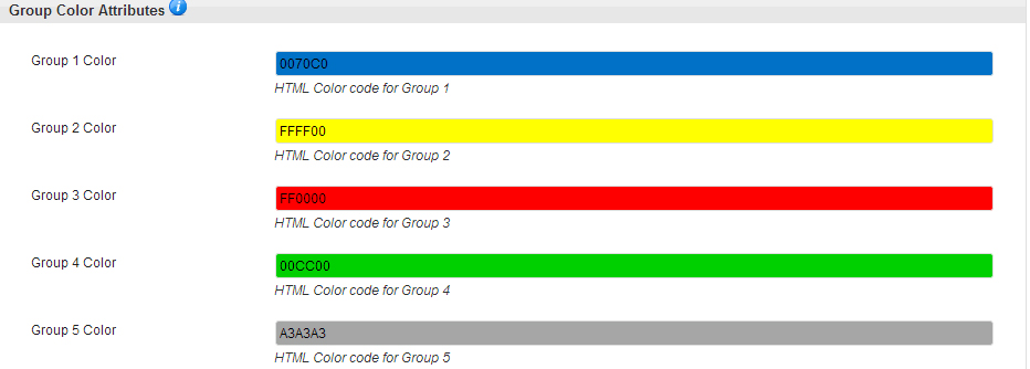
Colors
This is where you set the default colors for your Charts and Graphs. Have fun and play with this. Set your colors to anything you want.
The Group colors are extremely important, as these are what the lines, pies, and other elements of the chart will look like when you make it.
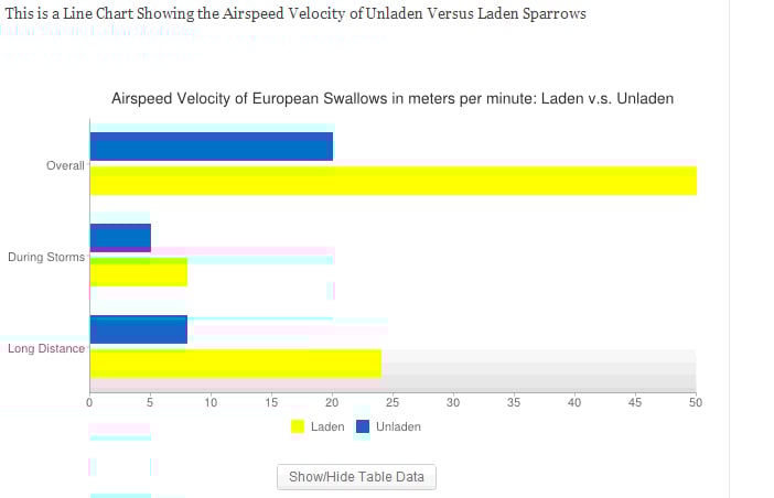
We’re going to walk through how the above chart was built. This is a simple horizontal bar graph. It shows imaginary figures for the airspeed of a Laden versus Unladen European Swallow.

FREE EBOOK
Your step-by-step roadmap to a profitable web dev business. From landing more clients to scaling like crazy.

FREE EBOOK
Plan, build, and launch your next WP site without a hitch. Our checklist makes the process easy and repeatable.
(No swallows were harmed in the making of this graph.)
Here is the code to generate the above horizontal bar graph using the default settings:
[easychart type=”horizbar” height=”100″ title=”Airspeed Velocity of European Swallows in meters per minute: Laden v.s. Unladen” groupnames=”Unladen, Laden” valuenames=”Overall,During Storms,Long Distance” group1values=”20,5,8″ group2values=”50,8,24″ ]
I’m sure some of you are scratching your head at this point and wondering just how this is ‘Easy’. Don’t worry, it really is. I’m going to walk you through this piece by piece.
- [easychart
This is the basic shortcode to insert a graph into your post or page. All Easy Chart Builder graphs use this short code.
- Type=”horizbar”
If you look above, I listed out all of the types of graphs that Easy Chart Builder can make. This is where you insert the type of graph you want to use.
- height=”100″
This is where you would change the height if you aren’t using the default. In this case, I modified it from 200 to 100. If you want to change the width, you would just insert width=”###”.
- title=”Airspeed Velocity of European Swallows in meters per minute: Laden v.s. Unladen”
The title is what shows above the graph. Every time you build a chart, you should give it a title. You will want to explain the purpose of the chart in the title.
- groupnames=”Unladen, Laden”
Charts and Graphs compare things. This is where you list all of the things you are comparing. In this case, we’re listing Unladen vs Laden European Swallows.
- valuenames=”Overall,During Storms,Long Distance”
When you compare multiple types of data, you need value names. Pie Charts do not use value names, since you’re comparing the group values.
- group1values=”20,5,8″ group2values=”50,8,24″
This is the heart and soul of your graph. Group1values is referring to the Unladen swallows. Group2values refers to the Laden swallows. Insert your numerical data fields here to turn them into your charts.
Once again, pie charts work slightly differently. They only use one value per group.
- ]
All Easy Chart Builder shortcodes end with ‘]’.
Syntax
When you’re working with Easy Chart Builder, it is important to realize that Syntax is important. Syntax is the way text is presented. Don’t exchange “ for ‘ – your codes won’t work. If it calls for a comma, you must use a comma. Don’t add spaces when a space is not called for.
Easy Chart Builder includes an error messaging system. All you need to do to access the error messages is to preview the post with your Easy Builder Chart shortcode.
An Error Message looks a little something like this:

This gives you a basic idea of what the error is and where to find it. In this case, I purposefully removed the “ after Laden in the group names section of the shortcode.
Now you know the basics to Easy Chart Builder. You can use even more parameters to build sophisticated charts and graphs. Go and have some fun building the perfect graph!
Tags: