Minimalist WordPress Themes
In a complicated and overcrowded online world, it’s refreshing to see a clean and simple site that gets the message across. These minimalist WordPress themes can help make your website one of them.
“Less is More.” “Clean and crisp lines.” “Utilizing white space.” “Simple, yet elegant.”
These are just a few common phrases that might come to mind when most people think of minimalism.
Another priceless saying I’d add would be:
“Keep It Simple Silly!” (KISS)
Because minimalist web design is so much more than the look of a site.
It’s making navigation a breeze for the user, it’s limiting confusion and overwhelm as much as possible, it’s providing a better user experience.
Which brings me to today’s article…
We’re reviewing different minimalist WordPress themes and judging each – not just by their cover – but by how they make life easier for both front and back-end users.
I’ve also taken the time to test out each theme and see how it operates inside of WordPress. So don’t expect any adjective ridden descriptions that were clearly copied straight from the themes website. We’re all about that hype-free life.
Oh, and one last thing:
All Of These Themes Are 100% Free, And You Can Install Them On Your WordPress Site Immediately
So let’s not delay.
1.Minimalist Blogger [SuperbThemes]
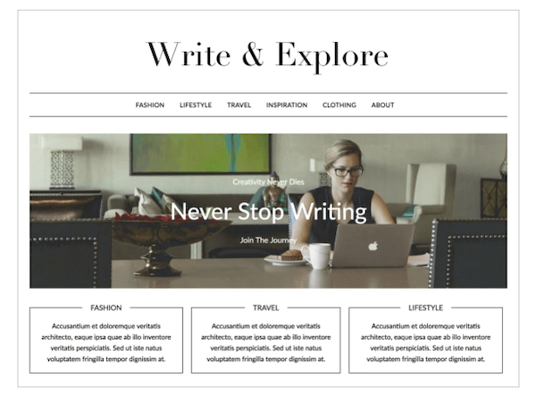
As you’d guess by the name, out of the box Minimalist Blogger suits anyone running a simple blog.
Right off the bat, MB comes with a helpful theme homepage packed with plenty of documentation and FAQs to help you get started.
Even though themes aren’t usually too difficult to get your head around, it’s a great addition for beginners who might need extra help.


When we get into customizing the theme in WordPress, Minimalist Blogger comes with all the adjustments you’d expect.
Features like changing the title, tagline, and logo you want displayed. You can also adjust the colors of your site, add a header image, choose which menus you want to display, and add widgets.
*These are all standard features for theme customization… so for the rest of this article I’ll only point out added functionalities that differ from the expected.

Another handy feature is the small shortcut icons that let you instantly edit a particular section of your site.
As shown in the example screenshot below, clicking on one of these icons allows you to adjust your site title and tagline immediately.
While nothing major, it’s a great example of a simple feature that creates a better user experience.


Overall, this theme is simple (duh!), but it still gives you enough functionality and features to create your own bloggers paradise.
The help and documentation pages were also a nice touch, and could be really useful for those new to the big bad world of WordPress.
If you fall in love with this theme and find yourself wanting more, you can also upgrade to the paid version to add more features and functionality.

2.Author [Ben Sibley]

According to the WordPress.org theme page: Author is a theme made for its namesake.
Its layout supposedly promotes readability, and the theme is best suited for simple blogs, magazines, or news sites. It also comes with complete WooCommerce support and is fully compatible with our friend Gutenberg.
But enough with the hype, let’s see how it all goes down in WP.
After activating the theme, you’re immediately taken to the “Author Dashboard” which is a pleasant surprise.

The dashboard gives you access to everything from a getting started guide, to support sites, and the themes change log.
The getting started guide is especially helpful, and details how to install and activate the theme. As well as the adjustments you can make, and what they each do.

Of course, the layout is clean and minimal (as you’d expect from the themes in this article). The sidebar also contrasts nicely with the central content of your site.

Looking at the customization options, all the usual suspects are available.
Some added features include “Blog” which has useful settings like whether to display posts and comments in full, along with the length of post excerpts.
You can also add a “scroll to top arrow” which is a small but helpful UX feature.

Finally, with a name like “Author” it’s no surprise you’re given some writer / blogger focused features.
For example, you can add a Gravatar to your site, as well as social, and contact links.
Overall, this theme provides an easy and simple way for bloggers and writers to get their content out to the world.
The author-specific features are also a fitting and useful touch. As well as the way the theme introduces users to its functionalities.
This shows how much they care about user experience and satisfaction (thumbs up Author!).
3.Wilson [Anders Norén]

It’s going to be extremely hard for me to resist making Cast Away references while talking about this theme, so bear with me.
WILSOOONNN! (that’s the last one I promise)… Is a simple and responsive theme made for personal sites and blogs.
According to the theme page, it comes with responsive design, retina ready assets, block editor / Gutenberg support, and more.
But before we get to how it operates inside of WordPress, Wilson doesn’t appear to offer much in the way of documentation.
It does however, have an active (used within the last year) support forum that you can reach if you need help.

When we get into the customization options of this theme, everything is stock standard.
But look harder and you’ll find some more features that make this option different to the other themes on this list so far.

First there’s the widgets section of the customizer.

FREE EBOOK
Your step-by-step roadmap to a profitable web dev business. From landing more clients to scaling like crazy.

FREE EBOOK
Plan, build, and launch your next WP site without a hitch. Our checklist makes the process easy and repeatable.
This is something I haven’t covered yet, only because most themes offer the same widgets.
But Wilson does have custom widgets which are useful in certain scenarios.
For example, the theme offers a custom video widget, as well as a Flickr widget (shown below), which might come in handy for you photography bloggers out there.

Some other handy features include the option to choose between two page templates:

As well as choosing from three different post types that compliment your blog style.

Overall, I’m a fan of this themes look (and name!) and it boasts some useful features we haven’t seen on this list so far.
It could do with some more documentation and guidance, however, you do have access to the WP.org support forum if you need it.

4.WP Diary [Mystery Themes]

In its own words, WP Diary is a WordPress theme that’ll fit perfectly with a blog, portfolio or news magazine website.
It looks the part offering a modern and stylish design, and is easy to customize and mould to your liking.
That’s what they say anyway, let’s find out what this theme is all about for ourselves.
The theme’s homepage gives you a good overview of what you can expect, and (hooray!) we have a help / documentation page we can visit if needed.

The docs are basic, but informative at the same time. And if you’re having any troubles with the theme, all you need to know is on this page.

When we move into WP, straight away we’re greeted with a “Welcome Page.” This page gives you the lowdown on the theme, along with some quick navigation links to different pieces of content.
For example, from here you can navigate straight to support or documentation. Which is what was lacking in the previous theme. A superior UX can make all the difference, people!

When we hit the customization stage, there are some unique features worth noting.
First we can add a slider, which is a creative way to show off your content.
There are also some “Additional Features” such as the ability to add social buttons to your header, along with the “Prettyphoto” setting which lets you ‘beautify’ your images and give them some extra pizzazz.

Another great feature is the “Design Settings,” where you can change the layout of your posts and pages.
For example, here’s the layout options you can choose from for your posts:

Overall, this theme delivers on its promise of a stylish and modern layout.
I also like that it saves users time by offering easy navigation, and it comes with plenty of customization so you can mould the theme to your liking.

5. Retro Blog [WPInterface]

Not gonna lie, the main reason I picked this last theme is because it looks so darn trendy!
But looks aren’t everything, so let’s give it a fair review like the rest.
According to the theme makers, Retro Blog suits influencers and infopreneurs, and aims to highlight your content with its crisp typography and retro styling.
When you first activate the theme you’re prompted to visit the theme page, where again, (yay!) you have some helpful documentation if needed.

The docs aren’t overly sufficient, but the information provided is only what’s necessary.

When we get to WordPress, the theme comes with the stock-standard customization options, along with some intriguing “Retro Blog Options.”

As seen below, these options allow you to add a banner slider, change the layout of your pages/posts, and more.
But the customization options aren’t the strongest point of this theme, and it’s the theme’s built in style and retro feel that sets it apart from other options.

To sum up, this theme definitely packs the documentation and help. However, it lacks slightly in the customization department.
But in my opinion (take it with a grain of salt), the style, typography, and retro feel of the theme make up for the lack of customization.
Besides, if you fall for this theme like I did, you can always upgrade to the pro version where you’ll have more features than you can handle.
Reviewing this plugin also makes me want to do a “Retro WordPress Themes” article, let me know in the comments if that’s something you’d be interested in seeing/reading.
A Minimalist Theme Can Go A Long Way
The reality is, a simple and clean (and free) website theme is just as impactful as an expensive or “edgy” one.
What’s most important is your intended message gets across with as little friction as possible.
Hopefully this article has inspired you to test some of the minimalist themes mentioned in this list for yourself.
Or who knows, maybe you’ll be inspired to start incorporating minimalistic design into other aspects of your work or life.
In any case, after spending some time around these themes, I’ve concluded a great minimalistic site typically has the following qualities:
- It’s simple, modern, and tasteful in the way it’s designed.
- It features plenty of help, support, or documentation.
- It’s provides a great user experience and is easily customized.
- It looks RAD, without being overly complicated.
On that note, be sure to let us know if I’ve missed any minimalist WordPress themes that you think deserve a mention.
And remember to always… KISS!
Rick Crawshaw Rick Crawshaw is a writer at WPMU DEV. Before joining the company and learning the ins and outs of WordPress web development, he worked as a freelance copywriter and marketer. You might also recognize his punny style from our weekly WordPress newsletter The WhiP. Follow Rick on Twitter.