Making WordPress More User Friendly – A Usability Audit of Joomla, Drupal, Blogger, Tumblr, and SquareSpace
It is safe to say that I spend more time with WordPress than I do with my wife :(
And even though WordPress and I have known each other for years, my wife has no real understanding what it is that I do, what WordPress is, or even what blogs really are.
So this weekend, when she asked how hard it would be to create a small website for a project she is working on, I took the opportunity and ran with it! She’s pretty good with maneuvering the interwebs, so I created a new WordPress site for her, told her I’d help if she had any questions, and went back to doing whatever it was that I was doing.
Sadly, 10 minutes later she came in with the news that she was giving up – she’d just create a PowerPoint for her project and be done with it.
You see, while WordPress and I are old pals, and I’ve come to love and know all of the quirks and understand the vernacular, Erika found WordPress to be intimidating and difficult to get to know.
I then set out to really figure out why…
Choices! There are so many choices!
Have you taken a look at the first screen shown to users in the dashboard when a new WordPress site is created lately?
In short, it is filled with text and tons of choices to make. Obviously, this is what scared my wife away.
A decade ago, I worked in a usability lab at The University of Texas. We ran new user experience tests and audits on websites and applications being created by the university. These were the days when image maps ruled all, search was inefficient, and the identity of the web was still being formed.
I learned during my years in the lab three important details key to web usability:
- Use as few words as possible
- Don’t confuse users with more options than necessary
- Have a clear path for visitors to follow with end goals in mind
It seems, that in an effort to satisfy as many use cases as possible, WordPress is going to the extreme in the other direction.
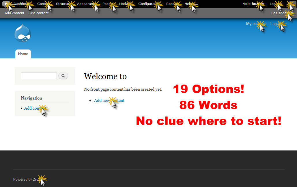
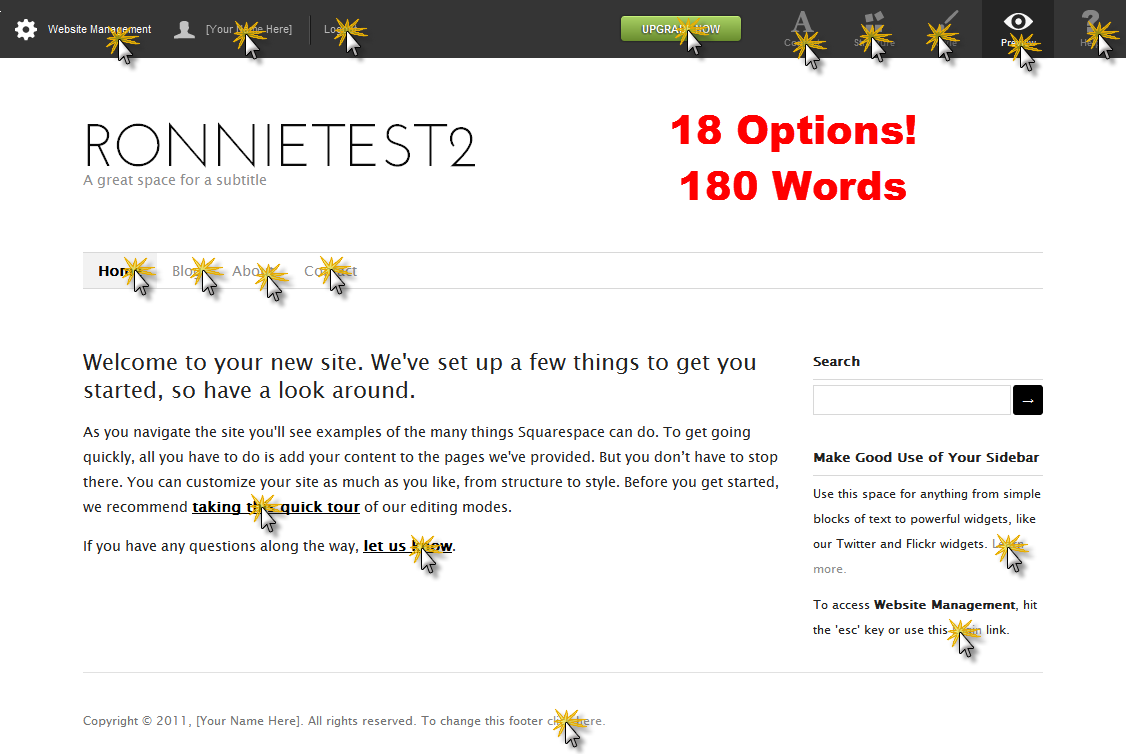
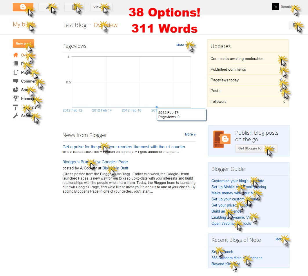
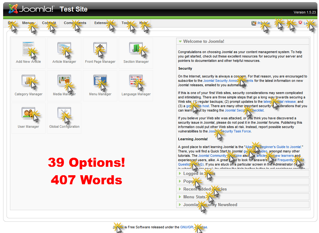
Take a look at these ‘new user experiences’ on WordPress, Joomla, Blogger, Drupal, Tumblr, and SquareSpace.
WordPress – 75 Links and 628 Words
Drupal – 19 Links and 86 Words
Tumblr – 28 Links and 67 Words
SquareSpace – 18 Links and 180 Words
Blogger – 38 Links and 311 Words
Joomla – 39 Links and 407 Words
FREE EBOOK
Your step-by-step roadmap to a profitable web dev business. From landing more clients to scaling like crazy.
FREE EBOOK
Plan, build, and launch your next WP site without a hitch. Our checklist makes the process easy and repeatable.
What can we do?
There is no doubt that the core WordPress team has put in an enormous amount of work and careful thought into all of the different links and item placements in the dashboard.
It would also be fair to say that it makes sense WordPress has by far the most options when getting started because it is truly flexible and highly customizable – all really good points!
But we’ve reached a time where the every-day web user will at some point want to be able to create a web presence, and for most basic projects, they shouldn’t have to hire professionals to get the job done. If WordPress can’t simplify the new user experience, we risk losing out to easier to use platforms more and more.
The big mistake being made with WordPress is that by trying to include more contextual help and options, we’re actually scaring the new users away we are trying to help.
Some quick and dirty ideas
Here are a few ideas that if implemented, would be a great start to simplify the WordPress experience. Before you leave a trollish comment below, I know that most (if not all) can be accomplished by plugins – but that isn’t the point at all. Ideas like these need to eventually make it into the core. For context, these ideas come from daily questions we get by new users at Edublogs – mostly educators that make up a wide range of tech and web experience levels.
- Kill the media and links menu items – Most media management is done from the page/post editor anyway. Perhaps move the media and links pages under the ‘Tools’ menu. For the most part, these are used less than others, and can be hidden a bit better.
- Clean up the dashboard – Make the ‘WordPress Blog’, ‘Other News’, and ‘Plugins’ dashboard widgets opt-in. They’ve become a bit overwhelming, and developers interested in the feeds most likely subscribe in other ways as well.
- Make help obvious but not intimidating – Contextual help and tool tips are excellent – but too many words to read and the user runs away. We should make the Help button stand out a bit more and keep as much help there as possible. Links to additional resources aren’t as good as help right inside the dashboard. A better goal would be to concentrate on feature placement so that help isn’t needed – items are where the user expects them to be.
- Test different names for menu items – For example, Settings > Reading, Settings > Writing, and Settings > Discussion all might be in need of revision. Wouldn’t Settings > Comments make more sense? And instead of in the Settings menu, why not in the Comments menu where people might expect it?
- Better use of the Plugins menu – The codex specifically says that the Plugins menu item is NOT for “configuration options for a plugin itself.” Though Automattic seems to ignore this with the configuration options for Akismet and WordPress.com stats menu items placed blatantly right where the rules say they “shouldn’t be”. However, I think they are on to something. My Settings menus can quickly have more than a dozen items when you start activating just a few plugins. It makes much more sense to me when plugins have just one settings page, for that settings page to be in the Plugins menu. If it were me, I’d keep the Settings menu item completely limited to core created items. Their importance get lost in the mix as it is.
- Your Profile is where? – I’ve never understood why the Your Profile menu item is under the Users menu. The top Dashboard menu item seems like a natural home.
- Screen Options tab – This might be another one that is better to be opt-in. I can’t tell you the number of emails we get from users that say their blog is broken because they can’t find a menu item that they have hidden under screen options sometime in the past. It is just more trouble than it is worth. Hopefully as the dashboard becomes more and more responsive in design, this tab won’t be needed at all.
What else?
Are there any ideas you have to improve the usability of WordPress?
Leave them in the comments below – we may just need to get on with creating some plugins to cover some of these to get the ball rollin’!
Featured image: Confusion by BigStockPhoto.com
Tags:


