Responsive WordPress Menu Plugin for Mobile Devices
The Responsive Select Menu plugin lets you automatically turn your “WordPress 3 Menus” into an easy-to-scroll select box/dropdown menu. (A “WordPress 3 Menu” is a menu created through the WordPress admin area: Appearance > Menus. Many people typically use these menus in their top navigation spot, as well as other places.)
The Plugin in Action
Let’s go ahead and jump right into some examples to show you what it looks like.
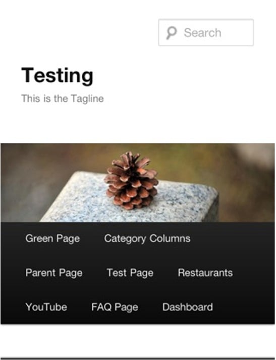
Here’s a look at a normal top menu in a mobile device using the WordPress Twenty Ten theme.
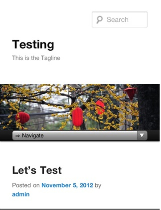
And now here’s a look at that same top menu with the Responsive Select Menu plugin activated.
When you touch the menu and pull it down, you get a select box/dropdown menu that you can easily scroll through with your finger.
Settings
The WordPress menu plugin comes with a number of settings. Here are a few of the more important ones:
- Control point when responsive menu kicks in
- Limit number of menu levels to display
- Control label/first item name on menu
- Disable certain menus
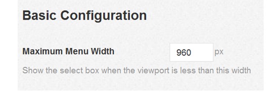
Here’s a look at the basic configuration options.
FREE EBOOK
Your step-by-step roadmap to a profitable web dev business. From landing more clients to scaling like crazy.
FREE EBOOK
Plan, build, and launch your next WP site without a hitch. Our checklist makes the process easy and repeatable.
Width Breakpoint
As mentioned, on the settings page, you can control at what width point the responsive menu kicks in. Therefore, you can set it to kick in even on a full-sized screen if the browser narrowed. For example, here’s a look at a narrowed browser on a full size screen without the plugin activated.
And here’s a look at the narrowed browser screen with the plugin activated.
This ability to control when the responsive plugin kicks would also allow you to do things such as set it to NOT kick in for a horizontal view on a typical tablet, for example. But then you could have it kick in when the table is turned vertically. The style of your particular site and the size of your particular menu will determine where you want the responsive menu to kick in.
See a Working Demo
You can see an example of the plugin in action here. If you’re on a full-size browser, just drag your browser down to a smaller size, and you will see the menu at the top of the page change.
Tags:


