The Web Design Trends Dominating 2015 and How WordPress Stacks Up
Web design has come a long way since the under construction GIFs and marquee scrolling of the GeoCities days. Back then, we could not have imagined what the biggest design trends would be in 2015
So which trends and techniques have come to define this year? I set out to uncover them by scrutinizing 200 of the top performing and most popular corporate sites and themes in and outside of WordPress. It was an exhaustive exercise, and one that revealed some obvious insights not to mention a few surprises along the way.
More importantly, I wanted to answer the question: Is WordPress keeping up with current design trends?
I’ll reveal my thoughts below, as well as my pick of the themes and plugins that can help you stay on trend.
What a Top Notch Design Can Do for You
When someone visits your site, your design is the first thing they see, obviously. If it’s not impressive you’re in trouble since 48% of your visitors will use it to decide whether or not they believe your business is credible. A whopping 94% of users leave sites that are poorly designed, according to IronPaper in their article 10 Web Design Statistics. Do you remember the last time you landed on a site with an awful design? Did you stick around long? I thought so.

You can see this idea in action by visiting Airbnb (pictured left) and VRBO (pictured right). Out of the two sites, which one are you more likely to browse?
Besides helping validate your brand, a killer style can help increase your sales. Neil Patel, co-founder of CrazyEgg, explains that a $20,000 investment in his site design had increased his conversions by 21% in his article How Saving On Design Could Cost You More In The Long Term. He also made back his money in less than a month.
In a world where technology and user habits change rapidly, being left behind can cost you.
Think about it: Your business has to not only compete with other companies and sites in the same industry, but also with those attention-hogging sites we know and love – Facebook, Twitter, YouTube, Vimeo, BuzzFeed, just to name a few.
If your site doesn’t look eye-catching, personable and professional, you won’t have enough time to convince your users you’re worth their time, let alone sell to them.
I think Chuck Longanecker, CEO of Digital-Telepathy says it best in his article Design is Marketing:
“Design is no longer optional; it is required for success …. In today’s design-minded culture, your product can be easily disrupted or ignored without a thoughtful design.”
The question is: What features ultimately make for a striking, attention-seeking site design?
Let’s answer that by taking a closer look at the design trends for the first half of 2015.
Top Four Design Trends
In all the sites I analyzed, there were four particular features that were prominent and that most or all of the sites had in common: A responsive layout, a list-style blog, CSS3 animations and bright colors.

These stats make sense when you consider 62% of companies that created responsive sites increased their sales, according to Econsultancy. That was back in 2013, but the stats have not changed – in fact, they have grown.
According to We are Social’s report called “Digital, Social and Mobile in 2015”, 51% of the world’s population uses mobile phones and 31% of the internet’s usage comes from smartphones.
In February, Google announced it would provide a boost to search engine rankings for responsive sites. In the company’s FAQ, there’s further explanation that sites designed for only large screens may see a significant decrease in their search rankings.
Each of the sites I analyzed weren’t simply functionally responsive, they had a specific layout designed for optimal viewing on mobile devices – visitors would not miss out on any content while using their smartphones or tablets.

cPanel’s site is a great example of optimal responsiveness. The mobile version is nearly indistinguishable from their desktop site while still loading quickly.
The message is steadily becoming more and more clear: If you’re not developing and using responsive site designs, you could very quickly become obsolete.
Rare Form New Media also reported last year that bright colors increased brand recognition by 80% and over 90% of a visitor’s buying decision was influenced by site design and usability. Colors were certainly visible among the tested sites.

Adding CSS3 animations is another trend that’s really popular among top sites and themes because it can help breathe life into an otherwise static page. When used in small doses, it can really bring an element of fun and excitement to your site.
When you scroll down on many sites, there is a featured list with icons displayed in a grid-style layout to display key features. This has been a strong trend for many years, but now the trend is for them to fade in with a little pop of additional movement to draw your eyes in.
It’s difficult to miss and looks fun so visitors are more likely to pay attention to what’s being presented to them. Thumbnails of posts also include subtle animations to join in on the eye-catching design.
The added CSS3 animations is a trend that’s growing strongly and if you’re not adding them to your theme, you may be missing out.
Trends Coming in Fast and Furious
There are several trends that are also becoming more and more prominent, including full-width page sections, sticky navigation, one-page themes and well-placed parallax scrolling.

A sticky navigation bar is one that is visible even when a user scrolls through the page and, quite frankly, it just makes sense.
Why make your users work to get to the top of your site to click through to a different page? The easier your site is to use, the better your bounce and conversion rates will be.
It also helps if your site looks eye-catching and full-width page sections help with that. Taking a look at how Asana’s website has been design and you’ll see striking page sections in action:

You may also have noticed that this site is a great example of both sticky navigation and the use of bright colors.
One-page themes are also beginning to pop up thick and fast and are quickly becoming more prevalent among WordPress themes and professional sites.
Our Panino theme is an excellent example. Clicking on arrow buttons or links in the navigation menu scrolls the page automatically to that section of the page rather than loading a new page.
Some themes also have little arrow buttons at the bottom of the page that scroll to the next page section when clicked.
Even displaying a single button at the bottom of the featured image of your homepage can be an effective and elegant way to extend your call to action and help make your site more interactive.
On the WordPress.com site, a button is strategically placed at the bottom of the featured image. Above the button, there are reasons listed for why you should join WordPress followed by some text: “Need more reasons?” When clicked, the page scrolls smoothly to the next section with – you guessed it! – more reasons why you should join WordPress.

You may have also seen our previous posts where we list many stunning parallax themes for WordPress, show you the right way to use parallax scrolling, and mention how it has lost some popularity in the past couple of years. It’s starting to make a comeback, though, at least when it’s done right.
Displaying one or two page sections with parallax scrolling is an effective way to show style without being over the top, and that’s exactly the trend that’s picking up steam.
There are two more trends that are quickly gaining popularity and if your theme doesn’t include them, you should really consider adding them.
Homepage Featured Images are the New Black
Image and video sliders have been a big trend over the past few years, but they are beginning to be replaced by full-width or full page featured images.

Although sliders can be a highly effective way to help drive an emotional connection with your business, you can still achieve this with well-thought out images.
It’s also worth mentioning that automatically scrolling sliders are not accessible to the visually impaired. For this reason alone, it’s easy to see why many designers are beginning to ditch sliders and opt for beautiful and colorful featured images for the homepage.
What was also interesting to see was that many sites and themes either exclusively displayed blog posts in a grid or masonry-style or had them as additional options. In fact, 42.5% of the sampled sites had a grid-style blog, while 15.5% had their posts displayed masonry-style.
Many people dismiss these options, which is clear when you consider 66.5% of sites either exclusively had a list-style blog or had this feature as an option, but different blog styles are on the rise.
It might be surprising to you that 0.5% included music and had a video slider that played automatically. I, for one, was shocked since I thought this was something that died out in the 1990s. It can be alarming to visit a site that has music playing, especially if you have the volume turned right up on your device, which was, unfortunately, the case for me.
If this is any indication of the collective experience of humanity, it might be a good idea to leave any automatic sound out of your site design.
The Bottom Line
So what have we learned from these design trend statistics?
- Your site should be responsive – It’s no longer good enough for your site to just be viewable on the go. The mobile version of your site should have similar capabilities and visuals as the desktop version.
- Bright colors can help make your business more memorable – While an excess of neon colors may not be all that inviting, bright colors are a trend you shouldn’t miss.
- Full-width or full-page featured images are a must – At least on your homepage. It’s time to start ditching those sliders.
- Full-width page sections are elegant and effective – Nothing displays information quite so cleanly and beautifully.
- CSS3 Animations can help bring your site to life – Placed above clickable thumbnails or buttons, animations can help your site form an emotional connection with your visitors.
- One-page themes are nothing to sneeze at – They’re gaining popularity and it’s easy to see why when you consider how amazing they look. They also help make your site more interactive and easy to navigate.
- Sticky navigation menus are here to stay – They just make sense. Why make your users work hard to use your site? Making it easy for them to navigate your site just makes sense.
By now, you may be thinking, “That’s great, but can I add these all-important elements to my WordPress theme?”
The short answer: Yes!
How WordPress Stacks Up
There are no shortages of free and premium themes and plugins when it comes to WordPress, but can they really help you keep in line with the current trends?
Absolutely, and that’s why I put together this collection of themes and plugins – both free and premium – to help you get there faster.
Themes: Trending Features Included
These themes include both free and premium options to help you find one that’s best for you and your needs. They’re also great for both single and Multisite installs.
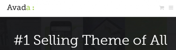
Avada
Avada is a fully responsive premium theme by the folks at Theme Fusion and is the number one selling themes on ThemeForest, and has been – on and off – for quite some time.
FREE EBOOK
Your step-by-step roadmap to a profitable web dev business. From landing more clients to scaling like crazy.
FREE EBOOK
Plan, build, and launch your next WP site without a hitch. Our checklist makes the process easy and repeatable.
It features parallax scrolling, featured images on the homepage, sticky navigation, CSS3 animations and full-width page sections.
Avada is also highly customizable so you can change the layout to suit your needs and choose between a list, grid or masonry-style blog.
Why is it a top selling theme? Simply because of its many layout and customization options, which serve to help you to tailor the multipurpose design to your specific needs with minimal, and sometimes no, coding at all. It’s versatile enough to be a suitable theme for just about any purpose.
X | The Theme
This is another premium multipurpose theme from Theme Forest created by Theme Co. It features bursts of bright color, sticky navigation, full-page featured image for the homepage, free extensions, full-width page parts and your choice of blog style.
Perhaps most importantly, it’s also fully responsive. If you’re looking to make a splash in your industry, this may be the perfect theme for you, especially since it’s highly customizable. It’s currently the second most popular theme on Theme Forest so it’s certainly one to consider.
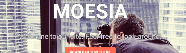
Moesia
Moesia is a free and popular WordPress that makes a big impression right off the cuff with a full-page featured image with parallax scrolling enabled for the homepage. It also includes many other high-quality features such as responsiveness, sticky navigation, CSS3 animations, full-width page sections and a list-style blog.
It includes many colorful buttons and elements, but you can also ramp it up with background images with even more color in them. It’s an incredibly professional and trendy-looking theme for photographers and professionals alike.
Gateway
Gateway is one more free and popular theme that’s different from the other themes on this list because it’s deceptively simple. It doesn’t include an excess of CSS3 animations or obviously defined full-width page parts, but its styling is so elegant it’s awe-inspiring.
When you view the demo, the full-page, parallax scrolling featured image is the clear star of the show and it provides the height of elegance this theme exudes. It’s sticky navigation trails with you down the page as you view the grid-style post listing with soft, white backgrounds for the page sections.
It has a list-style blog and is also fully responsive. If you’re looking for a theme to help you look as classy as chocolate-dipped strawberries on a silver platter, this is probably the theme for you.


Plugins to Help You Trend
These plugins are all free, popular and are updated regularly for best results. While most of them are made for single installs of WordPress, they should work error-free in Multisite networks.
Jetpack
With Jetpack’s many features, it can be easy to forget that it includes the Mobile Theme feature. When activated and configured, a mobile-friendly version of your site is displayed for multiple devices.
After activating Jetpack, select Activate for this feature, then Configure once the page reloads. On the settings page you can choose the options you would like and click Save configuration to apply the changes.
It may not be the perfect option for all sites, though, especially ones with special page parts and other features which activated with shortcodes or are otherwise theme specific.
Tabby Responsive Tabs
This plugin changes your text content into a responsive, accordion or tabbed page sections when viewed on mobile devices. It also supports multiple menus and is a lightweight plugin.
It’s easy to install and quickly integrates with your theme via shortcodes.
Responsive Column Widgets
Responsive Column Widgets is a plugin that helps you place widgets that are normally in your sidebar, into your page. Once you have organized them the way you would like, the new page sections are automatically responsive.
It’s easy-peasy to install and use and provides great results.
Envira Gallery Lite
This is the free version of the premium Envira Gallery plugin. Despite being free, it creates beautiful image galleries that are also responsive.
It’s easy to use and install, but has a limitation on the number of galleries you can create. If you need a large amount created, the premium version may be more your speed.
Responsive Menu
This plugin adds a hamburger icon to replace your regular menu to help you achieve a more responsive design. It’s as easy to install as most other plugins and includes 70 customizable options including colors, sizing, positioning and custom HTML.
Parallax Scroll
If you love your current theme or want to add parallax scrolling easily to a theme you found that’s sadly parallax-free, this plugin may be right up your alley. It installs quickly and easily with no special or extra steps.
From here, you can make use of the provided shortcodes to make any of your full-width page sections display with parallax scrolling. It works with any of your pages or posts.
If you’re a theme developer, you may be excited to hear you can use this plugin with the themes you are creating, but you can forego the shortcodes while keeping the parallax feature intact.
Pretty awesome, right?


Conclusion
This year’s web design trends include: responsive design, a list-style blog, CSS3 animations and bright colors, not to mention one-page layouts, CSS3 animations, full-width pages and the subtle use of parallax scrolling.
WordPress makes it easier to stay on trend, with many free and premium themes available to help you get started.
If you would like more ways to help improve your site and keep it hot and fresh, check out some of our other posts: Creating a Killer Home Page That Reduces Bounce Rate and 10 Highly Customizable, Responsive, and Free WordPress Themes.
Tags:
James Farmer CEO of Incsub, WPMU DEV, CampusPress & Edublogs