10 More Google Font Combinations for You to Use
This post is inspired by an article at Design Shack which has been a bit of a reference point for me over the past few months. The post list ten great Google font combinations – but since then lots of new fonts have been released, so I thought I’d do my own Google Font combinations that you can use.
To learn how to install the fonts, just check out this post from Monday which walks you through how to use the Google Font Directory. You can either install the fonts manually (I have provided the code) or you can use the WP-Google-Fonts plugin to do the work for you. Let’s get to it.
Lobster Two & Lato

Lobster was a début font from Pablo Impallari, and one of his most recent offerings has been Lobster Two – Lobster, but with less of a slant. It’s a beautiful font for headings. I’ve paired it here with Lato – a plain sans serif that lets Lobster Two really shine.
The Code
Insert before <head> tag in header.php
<link href='http://fonts.googleapis.com/css?family=Lato|Lobster+Two&subset=latin&v2' rel='stylesheet' type='text/css'>
OR
Insert at the top of your style.css
@import url(http://fonts.googleapis.com/css?family=Josefin+Slab|Muli|Lato|Nobile|Lobster+Two&subset=latin&v2);
The CSS
Add to style.css
h1 {

font-family: 'Lobster Two', Georgia, cursive;

font-style: normal;

font-weight: 400;

font-size: 64px;

text-transform: none;

text-decoration: none;

letter-spacing: 0em;

word-spacing: 0em;

line-height: 0.6;

}
p {

font-family: 'Lato', sans-serif;

font-style: normal;

font-weight: 400;

font-size: 13px;

text-transform: none;

text-decoration: none;

letter-spacing: 0em;

word-spacing: 0em;

line-height: 1.4;

}
Terminal Dosis & Caudex

Terminal Dosis is a beautiful sans-serif which is great for headings. The fine nature of the font makes it difficult to read for large amounts of text, but it looks stunning, especially when set alongside an ornate serif like Caudex.
The Code
Insert before <head> tag in header.php
<link href='http://fonts.googleapis.com/css?family=Terminal+Dosis+Light|Caudex&v2' rel='stylesheet' type='text/css'>
OR
Insert at the top of your style.css
@import url(http://fonts.googleapis.com/css?family=Terminal+Dosis+Light|Caudex&v2);
The CSS
Add to style.css
h1 {

font-family: 'Terminal Dosis Light', sans-serif;

font-style: normal;

font-weight: 400;

font-size: 64px;

text-transform: none;

text-decoration: none;

letter-spacing: 0em;

word-spacing: 0em;

line-height: 1.4;

}
p {

font-family: 'Caudex', serif;

font-style: normal;

font-weight: 400;

font-size: 13px;

text-transform: none;

text-decoration: none;

letter-spacing: 0em;

word-spacing: 0em;

line-height: 1.4;

}
Josefin Slab & Ubuntu
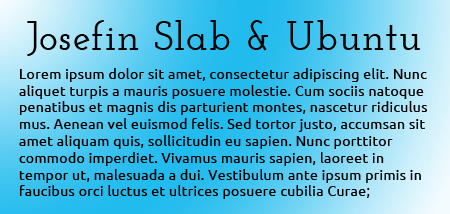
Josefin Slab is a modern slab serif font with clean, blunt serifs. I’ve used the semi-bold 600 version here as I feel that 400 is too fine. It’s complemented well by Ubuntu, a futuristic sans-serif with clean curves and blunt arms.
The Code
Insert before <head> tag in header.php
<link href='http://fonts.googleapis.com/css?family=Josefin+Slab:600|Ubuntu&v2' rel='stylesheet' type='text/css'>
OR
Insert at the top of your style.css
@import url(http://fonts.googleapis.com/css?family=Josefin+Slab:600|Ubuntu&v2);
The CSS
Add to style.css
h1 {

font-family: 'Josefin Slab', serif;

font-style: normal;

font-weight: 400;

font-size: 64px;

text-transform: none;

text-decoration: none;

letter-spacing: 0em;

word-spacing: 0em;

line-height: 1.4;
}
p {

font-family: 'Ubuntu', sans-serif;

font-style: normal;

font-weight: 400;

font-size: 13px;

text-transform: none;

text-decoration: none;

letter-spacing: 0em;

word-spacing: 0em;

line-height: 1.4;

}
Stardos Stencil & Muli
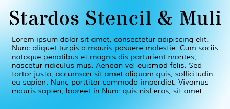
Stardos Stencil is a serif stencil font which I’m a fan of because, unlike many stencil fonts, it’s subtle and remains readable. I think it looks great with Muli, a modern sans-serif which itself has a slightly stencil-ish feel.
The Code
Insert before <head> tag in header.php
<link href='http://fonts.googleapis.com/css?family=Stardos+Stencil|Muli&v2' rel='stylesheet' type='text/css'>
OR
Insert at the top of your style.css
@import url(http://fonts.googleapis.com/css?family=Stardos+Stencil|Muli&v2);
The CSS
Add to style.css
h1 {

font-family: 'Stardos Stencil', cursive;

font-style: normal;

font-weight: 400;

font-size: 64px;

text-transform: none;

text-decoration: none;

letter-spacing: 0em;

word-spacing: 0em;

line-height: 1.4;

}
p {

font-family: 'Muli', sans-serif;

font-style: normal;

font-weight: 400;

font-size: 13px;

text-transform: none;

text-decoration: none;

letter-spacing: 0em;

word-spacing: 0em;

line-height: 1.4;

}
Corben & Varela

Corben has long been a favorite at wpmu.org, making an appearance as the logo in WPMU DEV’s GridMarket theme. It’s ample curves and classic display lettering look great with the clean and minimalist Varela.
The Code
Insert before <head> tag in header.php
<link href='http://fonts.googleapis.com/css?family=Corben:700|Varela&v2' rel='stylesheet' type='text/css'>
OR
Insert at the top of your style.css
@import url(http://fonts.googleapis.com/css?family=Corben:700|Varela&v2);
The CSS
Add to style.css
h1 {

font-family: 'Corben', serif;

font-style: normal;

font-weight: 700;

font-size: 64px;

text-transform: none;

text-decoration: none;

letter-spacing: 0em;

word-spacing: 0em;

line-height: 1.4;

}
p {

font-family: 'Varela', sans-serif;

font-style: normal;

font-weight: 400;

font-size: 13px;

text-transform: none;

text-decoration: none;

letter-spacing: 0em;

word-spacing: 0em;

line-height: 1.4;

}
FREE EBOOK
Your step-by-step roadmap to a profitable web dev business. From landing more clients to scaling like crazy.
FREE EBOOK
Plan, build, and launch your next WP site without a hitch. Our checklist makes the process easy and repeatable.
Limelight & Merriweather

Limelight is an art-deco 1920s style font that has echoes of the classic days of Hollywood cinema. It’s geometric forms really only look good when displayed at large sizes. It looks great beside the soft serifs of Merriweather. Merriweather is a continually evolving font with its own website and with constant new additions to the family.
The Code
Insert before <head> tag in header.php
<link href='http://fonts.googleapis.com/css?family=Varela|Limelight|Merriweather&v2' rel='stylesheet' type='text/css'>
OR
Insert at the top of your style.css
@import url(http://fonts.googleapis.com/css?family=Varela|Limelight|Merriweather&v2);
The CSS
Add to style.css
h1 {

font-family: 'Limelight', cursive;

font-style: normal;

font-weight: 400;

font-size: 64px;

text-transform: none;

text-decoration: none;

letter-spacing: 0em;

word-spacing: 0em;

line-height: 1.4;

}
p {

font-family: 'Merriweather', serif;

font-style: normal;

font-weight: 400;

font-size: 13px;

text-transform: none;

text-decoration: none;

letter-spacing: 0em;

word-spacing: 0em;

line-height: 1.4;

}
Radley & PT Sans

You might recognise Radley – it’s the font used for the titles right here at wpmu.org. It was designed from woodcarved letters and still retains some of that rustic feel while still being an elegant serif. I feel it works well with PT Sans, a popular and clean sans-serif that is easy to read.
The Code
Insert before <head> tag in header.php
<link href='http://fonts.googleapis.com/css?family=Radley|PT+Sans&v2' rel='stylesheet' type='text/css'>
OR
Insert at the top of your style.css
@import url(http://fonts.googleapis.com/css?family=Radley|PT+Sans&v2);
The CSS
Add to style.css
h1 {

font-family: 'Radley', serif;

font-style: normal;

font-weight: 400;

font-size: 64px;

text-transform: none;

text-decoration: none;

letter-spacing: 0em;

word-spacing: 0em;

line-height: 1.4;

}
p {

font-family: 'PT Sans', sans-serif;

font-style: normal;

font-weight: 400;

font-size: 13px;

text-transform: none;

text-decoration: none;

letter-spacing: 0.025em;

word-spacing: 0em;

line-height: 1.4;

}
Bowlby One SC & Maven Pro
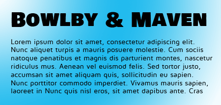
Bowlby One SC is another font inspired by the early 20th century. It is a large, bold type that only looks good when used for large headings. Its sharp lines contrast well with the smooth curves and modern design of Maven Pro, a sans-serif with four variations.
The Code
Insert before <head> tag in header.php
<link href='http://fonts.googleapis.com/css?family=Bowlby+One+SC|Maven+Pro&v2' rel='stylesheet' type='text/css'>
OR
Insert at the top of your style.css
@import url(http://fonts.googleapis.com/css?family=Bowlby+One+SC|Maven+Pro&v2);
The CSS
Add to style.css
h1 {

font-family: 'Bowlby One SC', serif;

font-style: normal;

font-weight: 400;

font-size: 48px;

text-transform: none;

text-decoration: none;

letter-spacing: 0em;

word-spacing: 0em;

line-height: 1.4;

}
p {

font-family: 'Maven Pro', cursive;

font-style: normal;

font-weight: 400;

font-size: 13px;

text-transform: none;

text-decoration: none;

letter-spacing: 0.025em;

word-spacing: 0em;

line-height: 1.4;

}
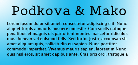
Podkova & Mako
I like Podkova because at first glance it seems like a standard slab but it has some unusual letterforms, particularly the diagonals on the vertical arms. Mako, as a simple sans-serif, provides a good balance to it.
The Code
Insert before <head> tag in header.php
<link href='http://fonts.googleapis.com/css?family=Podkova|Mako&v2' rel='stylesheet' type='text/css'>
OR
Insert at the top of your style.css
@import url(http://fonts.googleapis.com/css?family=Podkova|Mako&v2);
The CSS
Add to style.css
h1 {

font-family: 'Podkova', sans-serif;

font-style: normal;

font-weight: 400;

font-size: 48px;

text-transform: none;

text-decoration: none;

letter-spacing: 0em;

word-spacing: 0em;

line-height: 1.4;

}
p {

font-family: 'Mako', serif;

font-style: normal;

font-weight: 400;

font-size: 14px;

text-transform: none;

text-decoration: none;

letter-spacing: 0.025em;

word-spacing: 0em;

line-height: 1.4;

}
Didact Gothic & PT Serif
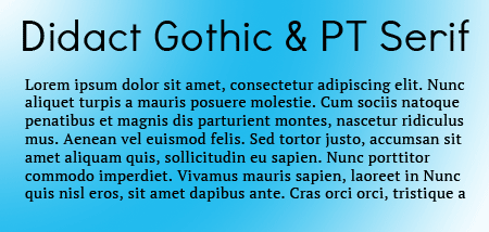
Didact Gothic is such a lovely sans-serif that I wanted to use it for a heading. I thought it would look good with a clean and subtle serif and PT Serif definitely does the trick. The two of them together look elegant and professional.
The Code
Insert before <head> tag in header.php
<link href='http://fonts.googleapis.com/css?family=Didact+Gothic|PT+Serif&v2' rel='stylesheet' type='text/css'>
OR
Insert at the top of your style.css
@import url(http://fonts.googleapis.com/css?family=Didact+Gothic|PT+Serif&v2);
The CSS
Add to style.css
h1 {

font-family: 'Didact Gothic', sans-serif;

font-style: normal;

font-weight: 400;

font-size: 48px;

text-transform: none;

text-decoration: none;

letter-spacing: 0em;

word-spacing: 0em;

line-height: 1.4;

}
p {

font-family: 'PT Serif', serif;

font-style: normal;

font-weight: 400;

font-size: 14px;

text-transform: none;

text-decoration: none;

letter-spacing: 0.025em;

word-spacing: 0em;

line-height: 1.4;

}
Hope you find those fonts useful! What are your favorite Google Fonts? How do you combine them? Let us know in the comments!
Tags:

