10 of the Ugliest Logos in the World
I’ve had a number of readers chastise me recently for not using the “official” WordPress logo. And I get that. Logos matter to people. Design matters. Not only does it make the user’s experience better (if it’s good), it helps increase trust.

But I often don’t use the official logo because I don’t like the WordPress color scheme much. I’m not crazy about the blue or the orange they use, and I pretty much flat out hate the brownish-gray they like to stick everywhere.
Remember this?

On top of that, although there’s a lot to love about WordPress, they have had a track record of some flat out ugly designs in their Admin areas over the years, and so I’ve learned not to bow to Automattic when it comes to design. (I will say that the overall design has improved over the years, and even dramatically of late, in my opinion.)
And so I don’t hate the WordPress logo. In fact, I even like it in many cases, especially when different people get their hands on it and cook up something creative.
Continue reading, or jump ahead using these links:
Ugly as Inspiration

But the impetus for this post was not really WordPress. It was something that happened recently with a baseball team. The Florida Marlins recently changed their name to the Miami Marlins, got a new stadium, and changed their team’s logo.
The first two are likely to be positive moves. The changing of the logo, however, is already proving to be a disaster. The new logo looks as if a box of crayons went out for a night of heavy drinking and then tossed its cookies all over the bathroom floor.
Here are a few reviews I snagged from the web:
- worst ever
- hideous
- awful
- atrocious
- absurd
- LMAO
- seriously?
- ewwwwwww
What is Art?
Art is a matter of taste. I get that. But when the taste is the flavor of vomit, somebody has to stand up and say something. And so in this post I’ve found what I consider to be perhaps ten of the ugliest logos going.
I’ve taken it easy on small businesses here. In any case, there are too many of them to begin going down that road. Arm a small business owner with some free clipart, sixty minutes, and a few grand ideas; and it’s likely to get pretty ugly. Literally.
So, in no particular order, here they are.
10 of the Ugliest Logos in the World
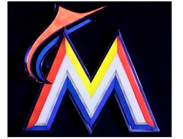
1. Miami Marlins
New logo first. Old logo afterward.
New:

Old:

2. Starbucks
Not a fan of the new logo (though I imagine I’ll get used to it). Not a fan of their first logo either. Or the second one now that I think about it.


FREE EBOOK
Your step-by-step roadmap to a profitable web dev business. From landing more clients to scaling like crazy.

FREE EBOOK
Plan, build, and launch your next WP site without a hitch. Our checklist makes the process easy and repeatable.
3. Waffle House
The good: Hard to miss when you’re driving down the road.
The bad: Hard to miss when you’re driving down the road.

4. Animal Planet
Not sure how an “M” lying on its side is supposed to represent animals.

5. Gap
In 2010, Gap clothing stores made a switch to a new logo, only to reverse the decision a week later after a public outcry.

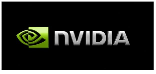
6. Nvidia
What is it? A fish? A dysfunctional “e”? Someone’s eye in the middle of an acid trip?
7. Google
We’re used to it, yes. But let’s face it, it’s not pretty.

8. Wired
Not necessarily horrible, just ugly. There’s a story behind it with lots of explanations and math trying very hard to justify it. A reason, unfortunately, isn’t necessarily a legitimate excuse.

9. TechCrunch
Again, lots of explanation sounding suspiciously like justification (and, again, failing). The title of the linked to post is Redesigning TechCrunch: We Picked This Logo Just to Piss You Off. When you make a mistake, get obnoxious. That’s what I always say.

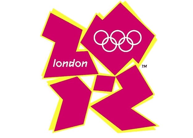
10. London Olympics 2012
The Olympics deserves a category all its own when it comes to bad logos. There always seem to be too many colors going in too many directions, an abundance of trying very hard to be the deep thought of every beauty queen’s perfect answer, and a lot of awkward abstraction that needs to be either more abstract or less abstract.
It gets worse …
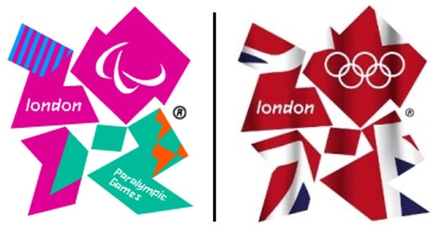
Thanks to EMMEALCUBO for the image.
Tags:
Aileen Javier Aileen has over 10 years of experience in content writing and content marketing. She’s handled content teams, planned editorial calendars, and managed projects. She’s also written blogs, web copy, social media posts, and email newsletters for brands in different industries.