Better Forms with the Enhanced User Interface
If you want to capture information from your website visitors, having user-friendly forms is a necessity. On the other side of the coin – having clunky, hard to use forms will almost certainly assure your visitors never submit any information.
That’s why so many site admins turn to Gravity forms, a premium form plugin that works amazingly well with WordPress.
In today’s daily tip, we’re going to show you one simple adjustment you can make to your standard gravity forms that will make them more user-friendly, and more in-line with what users expect to see with online forms today.
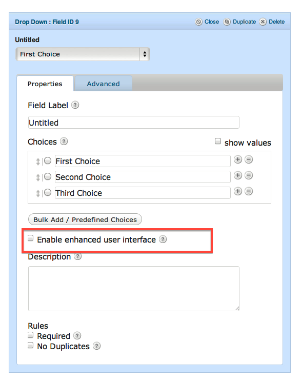
It’s called the Enhanced User Interface, and it can be found in many of the standard and advanced form fields found inside your gravity forms editor.
The enhanced user interface brings search functionality inside your form field. Rather than just simply entering or choosing a selection within that field, your users can search using their keyboard, and the form narrows the field options to the user’s search. It’s alot like Google’s autocomplete feature in search – and it works very well on forms where you give your users many options from which to choose.
User Interface Comparison
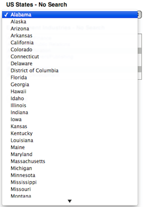
The two images below show the difference in user interfaces. The image on the left is the standard interface and the one on the right is the enhanced.
On the left, your standard drop down box. You need to scroll down the list until you find what you need.
On the right is the enhanced box, where scrolling isn’t required at all. Simply type a letter into the search feature and it narrows down your choices.
In the image below I’ve created a simple drop down box using US states as the selector options. Normally this list would take some scrolling to reach the bottom, but with the enhanced view selected, I simply type the letters “MA” and it returns three choices from which I can select without any scrolling.
FREE EBOOK
Your step-by-step roadmap to a profitable web dev business. From landing more clients to scaling like crazy.
FREE EBOOK
Plan, build, and launch your next WP site without a hitch. Our checklist makes the process easy and repeatable.
Multiselect Enahnced User Interface
The enhanced user interface works well with multi-select boxes too. Normally, with a multi-select box you’d have to scroll through the list and click the CTRL button when selecting multiple options.
And then even after those options are selected, because most forms only show the first few choices in the form window, the choices you selected might not even be visible – which can be quite confusing as a web visitor. This is displayed in the image below, in which I selected several fields from the Employment Industries field, only one of which (Government / Military) is shows in the actual window just above the submit button.
But with the enhanced mutli-select box, the form field works more like a tag cloud. In the image below you can see I chose several fields and they all show up in a window above the form field, as gray boxes in a tag-like view. This brings all your choices to the top and makes it easier to see what you’ve selected.
Plus, if you want to deselect an option you don’t have to go back and search the multi-select list, remember to hit CTRL when de-selecting that option. In the enhanced mode, you simply click the “X” next to the choice and it is removed.
Make your forms easier to use and easier to read by selecting the enhanced User Mode from Gravity forms.
Tags:


