How to Turn Your Website into an Automated Sales Machine (Part V)

The Call to Action
(This is the fifth and final post in a series. You can see previous posts here: Part I, Part II, Part III, Part IV.)
For some reason, people need to be told what to do: Buy Now, Subscribe, Watch the Video, etc. So when you want your visitors to DO something, you need to tell them exactly what to do, or “call them action.”
Go to any large, successful website that sells something, and you will see calls-to-action in action.
Let’s take a look at a few:
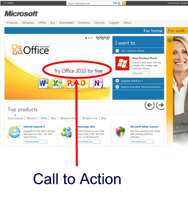
Microsoft’s Call to Action
Apple’s Call to Action
We talked before about having a top-flight salesperson and how you can automate your website to act as that salesperson for you. Traditionally, the one thing a salesperson always needed to do eventually was to “ask for the sale.” Online, this is where your call-to-action comes in.

But of course you don’t always need to “ask for the sale” up front. A call-to-action doesn’t necessarily have to be a “Buy now!” command (although it can be, of course). Depending on where your visitors are in the buying process (as we talked about in Part II), you may want them to take some other action first in order to ease them into your clutches … um, I mean your sales funnel. :)
You’ll notice that’s exactly what both Microsoft and Apple have done above. Microsoft says, “Try Office 2010 for free.” And Apple just wants you to watch a few videos.
And so the gist of a call-to-action is pretty simple. Just tell your visitors what to do. However, there are some things you should keep in mind when putting call-to-action links on your website.
STRATEGY
5 Strategies for Making Your Calls to Action Work
1. Position Your Call-to-Action Above the Fold
We talked in Part I about how your USP (Unique Selling Point) needs to clearly stand out. Your call-to-action also needs to clearly stand out. (Some choose to have them together in the same graphic.) You will notice on both the Microsoft and Apple sites above that there is little to distract the visitor. Both calls-to-action are clearly above the fold. Someone may go to either of those sites with something else in mind, but in both cases there’s a good chance that the calls-to-action are going to be noticed.
2. Use Color to Make Your Call-to-Action Stand Out
James from right here at WPMU.org wrote a recent post about changing up some design elements.
One of the changes was color. He reports, “A massive (and probably fairly obvious to guess) initial stat is that the new design has boosted free user registrations by well over 200%.” If that number doesn’t make your eyes pop, then let me say it another way: COLOR MATTERS!
Changed from a Yellow to a Green One
3. Use Space to Make Your Call-to-Action Stand Out
Give it breathing room so it doesn’t get lost in the clutter.
Let’s look at a site that I’m quite sure knows what they’re doing in these areas: eBay.

4. Words Matter
Position and color and space all matter, but so do words. The text you use for your calls-to-action can influence their effectiveness as much as design.
The Highrise Story
An interesting example of this comes from the company 37signals. They decided to change their call-to-action button on their HighriseHQ homepage from “Free Trial” or “Sign-up for Free Trial” to “See Plans and Pricing.” Some people, they reasoned, may not sign up for a free trial for fear of being automatically stuck into a subscription they may not want.
The result was a 200% increase in sign-ups. (source: ThinkVitamin)
“See Plans and Pricing,” however, is not necessarily some magical catch phrase that will automatically boost your sign-ups by 200%. You will need to test what works for you. But know that a small change can make a big difference.


FREE EBOOK
Your step-by-step roadmap to a profitable web dev business. From landing more clients to scaling like crazy.

FREE EBOOK
Plan, build, and launch your next WP site without a hitch. Our checklist makes the process easy and repeatable.
The Dell Story
Dell is famous for a similar story. The computer company made an additional $25 million dollars by changing their “Learn More” call-to-action to “Help Me Choose.” That’s it. They changed one little phrase and scored an extra $25 million for it.
“Learn More” is not bad, but when you look at them side-by-side, you can see that “Help Me Choose” involves the visitor more and highlights the interactivity taking place. Dell, the company, (the automated website, actually) is an ACTIVE participant in the visitor’s buying process. There’s a relationship going on here, and on Dell’s end, it’s all completely automated.
5. Put Calls-to-Action in Various Places
Everyone’s situation is different. For many, a clear call-to-action on the homepage with little else around it is a smart choice. In other places on the site, however, you may have several different calls-to-action in various places.
Amazon – The Testing King
I like going to Amazon when thinking about online marketing and user interfaces. As I mentioned in another post, you can be sure that every single tiny element of the Amazon site has been tested and tested down to the bone.
On my most recent visit (and on many days, it seems), there was a letter to customers from CEO Jeff Bezos on the front page. Bezos spends the text in the letter talking about Kindle e-readers, yet he doesn’t use a call-to-action.
Some might be thinking, “WHAT? How can that be? The call-to-action is the staple of any sales, online or off. Why isn’t Amazon using calls-to-action?”
Well, don’t give up on Amazon just yet. Bezos uses a trick that experienced marketers know works like a charm. After his signature, he adds a P.S. And what do we find in the P.S.? … Yes, you guessed it, a call-to-action: “watch this short video.”
The P.S. section is a very powerful place to put a call to action because most everyone reads the P.S., even if they don’t read the main body of the letter. A P.S. section also says, “This is important.”

More Calls-to-Action
Down the right-hand side of the Amazon page you will notice five different ads, each with a clear call-to-action button.
And then at the bottom of the Amazon page, you will see even more calls-to-action. The first is “Continue Shopping.” Below the top sellers, there is the “Make Money with Us” column that consists of all calls-to-actions. And of course the titles of the columns themselves could be considered calls-to-action: Make Money with Us (for sure), Get to Know Us (seems like one in a way), Let Us Help You (seems pretty close).


And so as you can see, the front page of Amazon is almost nothing but calls-to-action.
***By the way, there is another call-to-action on this page that I haven’t mentioned here. Can you find it? Leave your answer in the comments.
Call-to-Action Plugins
Of course if you’re using WordPress, then you know there is a plugin for just about everything, and calls-to-action are no exception. The free version of this call-to-action plugin puts an author box at the bottom of each post with your message and a link. The upgraded pro version ($37 at the time of the this writing) will let you put messages at the bottom of every post or page or in a widget area. You can also use different messages or different types of messages (email form, video, button, etc.) depending on the category. This can be handy because you may need to have different messages depending on where your visitor is on your site.
This widget-based call-to-action plugin displays a calls-to-action in your sidebar. You can match different calls-to-action to different categories.
Turning Your Website into an Automated Sales Machine
OK, so we’ve come to the end of the five part series. There are surely other things that you can do in order to help increase sales on your site, but if you can address what’s been discussed in these five posts, you will create a powerful, automated machine that will interact with your visitors, answer their questions, create a relationship, build trust, and even prod them to buy … all while you sleep.
(This is the fifth and final post in a series. You can see previous posts here: Part I, Part II, Part III, Part IV.)
>> Don’t forget to find the remaining call-to-action on Amazon’s homepage and mention it in the comments.
(Amazon Homepage – These screenshots were taken while not logged in, so you may get something slightly different while logged in. The remaining call-to-action should be still there; however, you may find many more calls-to-action once logged in.)
(Thanks to Sean MacEntee for his call to action image. Thanks to HikingArtist.com for the image.)