Break Your WordPress Theme Menus Free From Their Restraints!

Your WordPress Theme Menus where you want them!
You’ve surely come across a WordPress theme and said to yourself, “Oh this is a beautiful theme, but I wish the menu wasn’t right there!” Well, WordPress theme menus don’t have to be only where the theme designers put them.
Today we’re gonna look at a few ways you can re-position the main navigation in pretty much any WordPress theme. You’re not limited to only the main nav, as you can also use these methods to re-position any other WordPress theme menu in themes that have more than one.
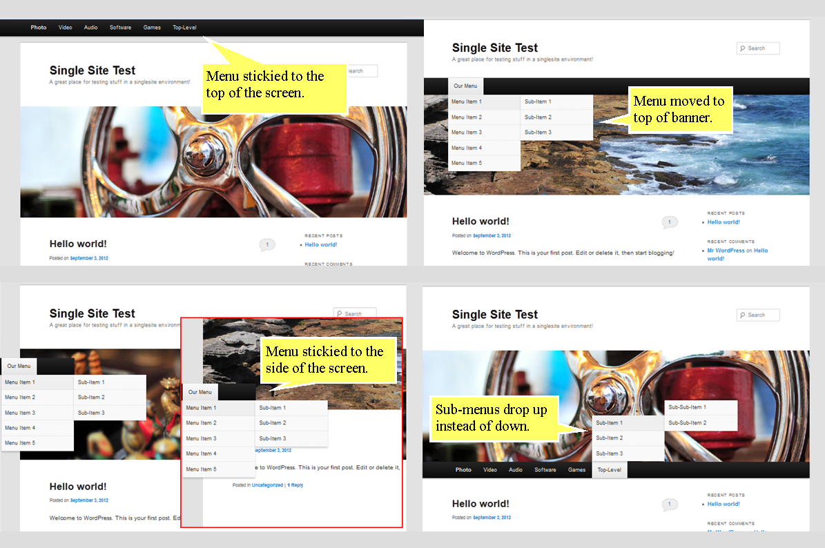
Oh, and the methods in this tutorial do not require any php code edits whatsoever. Everything can be accomplished with a little CSS magic in the theme’s style-sheet. Below are a few screenshots from the WordPress default “Twenty-Eleven” (2011) theme showing the end results of the methods we’ll be exploring today.

Each exercise in this tutorial references the main nav ID from the 2011 theme. Don’t worry though, to adapt these methods to your theme, simply change the ID (#access) to the actual ID of your theme’s navigation container and you’re good to go! Ready? Let’s get started.
Find the ID of the nav container
The first thing you need to do, and this applies to each method described below, is to identify the ID of the container of the nav element you want to change in your theme. If you don’t know what that ID is, you can easily find it using your browser’s developer tools (see the “Identify the main nav container” section of this post for some tips). Got the ID? Good.
1) Re-positioning the main nav in the theme
Let’s start with a simple exercise: re-positioning WordPress theme menus up or down in a theme. This is actually one of the simplest edits you can make, and it can have a truly dramatic impact on the appearance and usability of your site. All you need to do is add the following snippet to your theme’s style-sheet.
body #access {
position:absolute;
top:150px;
}
The magic happens with position:absolute;. That rule effectively pops the container free from the restraints of the theme, allowing you to re-position it up or down simply by adjusting the value of top:150px;. A word of caution is in order here though: 2011 is a responsive theme. Like all responsive themes, the use of fixed-pixel values doesn’t always give the best results. Experiment a bit with different pixel values at different screen sizes and/or different devices. Or try different properties such as em or % or rem to get the results you want.
FREE EBOOK
Your step-by-step roadmap to a profitable web dev business. From landing more clients to scaling like crazy.
FREE EBOOK
Plan, build, and launch your next WP site without a hitch. Our checklist makes the process easy and repeatable.
2) Stick to the top or bottom of the screen
This is another simple edit you can do to make one of your WordPress theme menus stick persistently to the top or the bottom of the screen as you scroll. This time the magic is done with position:fixed; as in the CSS snippets below.
Use the following to stick to top of screen. Adjust the top setting if needed (included here in case you have the WordPress toolbar activated). Also, if you stick a menu to the top of the screen, you may want to add a margin to the top of your theme to make room for it (the 1st part of the following snippet… adjust to fit).
body {
margin-top:25px;
}
body #access {
position:fixed;
top:25px;
left:0;
width:100%;
Use the following to stick a menu to the bottom of the screen. You’ll likely need to also add some style rules to get sub-menus to drop up instead of down (see the next part for that).
body #access {
position:fixed;
bottom:0;
left:0;
width:100%;
3) Make sub-menus drop-up instead of down
If you need your sub-menus to drop up instead of down (e.g.: a menu stuck to the bottom of the screen), add the following to your style-sheet. The 2nd part of the below snippet ensures that fly-out sub-sub menus align properly with their parent menu items.
#access ul li:hover ul {
bottom:100%;
top:auto;
}
#access ul ul li:hover ul {
bottom:0;
}
4) Stick to the side of the screen
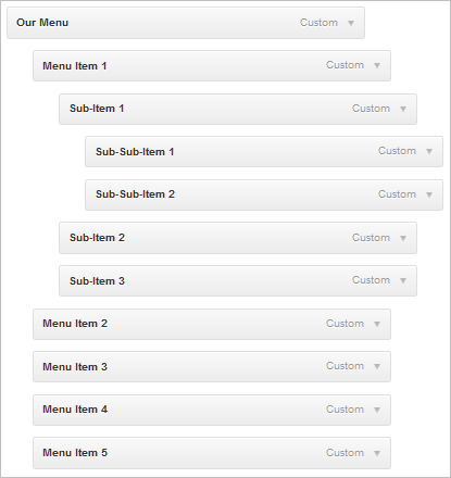
Finally, here’s an easy way to ensure that one of your WordPress theme menus stays persistently on the side of the screen as you scroll. Here, we’re popping the menu out of the theme, and making all menu items children of a single main item that serves as a menu header (see the screenshot below for how to set up your menu for this).
body #access {
position:fixed;
left:0;
top:230px;
width:193px;
}
body #access ul ul {
display:inline;
}
body #access ul ul ul {
display:none;
}

As always, I hope you enjoyed this and find use for it. If you need help with any part of this tutorial, please leave a comment (with a link if possible) and I’ll try to help you over any humps :)
Tags:
